Creating Product Mockups That Accelerated Custom Order Approvals

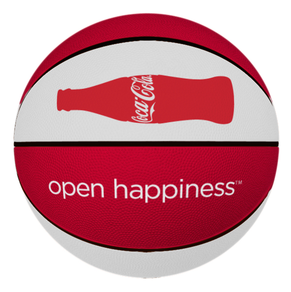
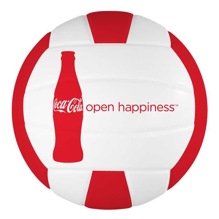
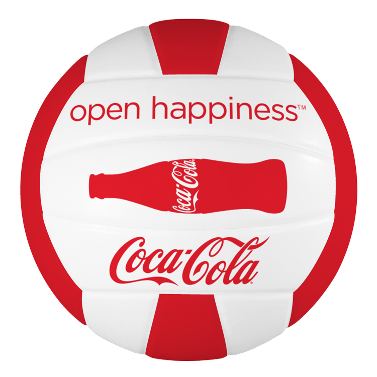
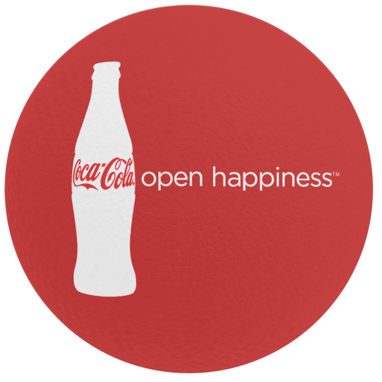
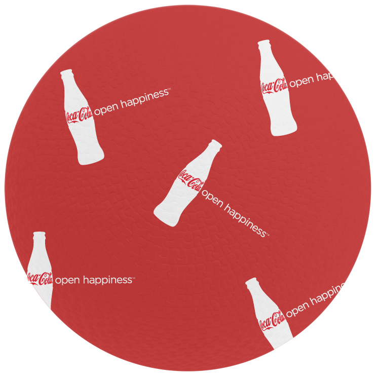
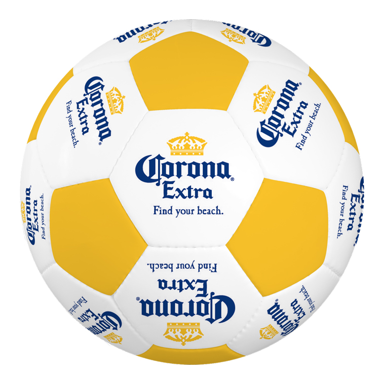
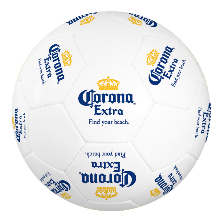
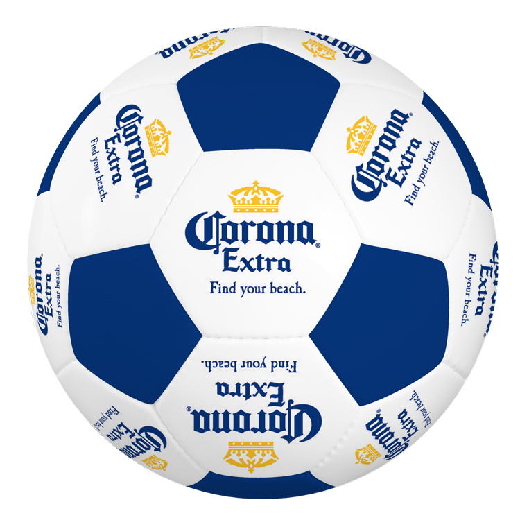
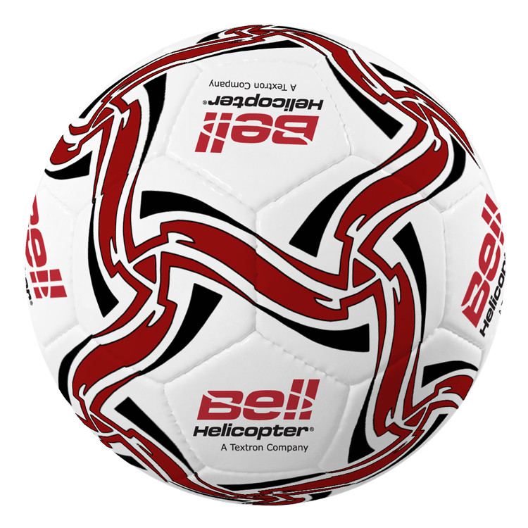
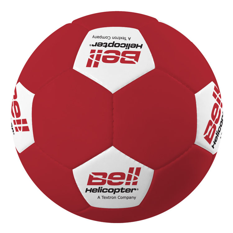
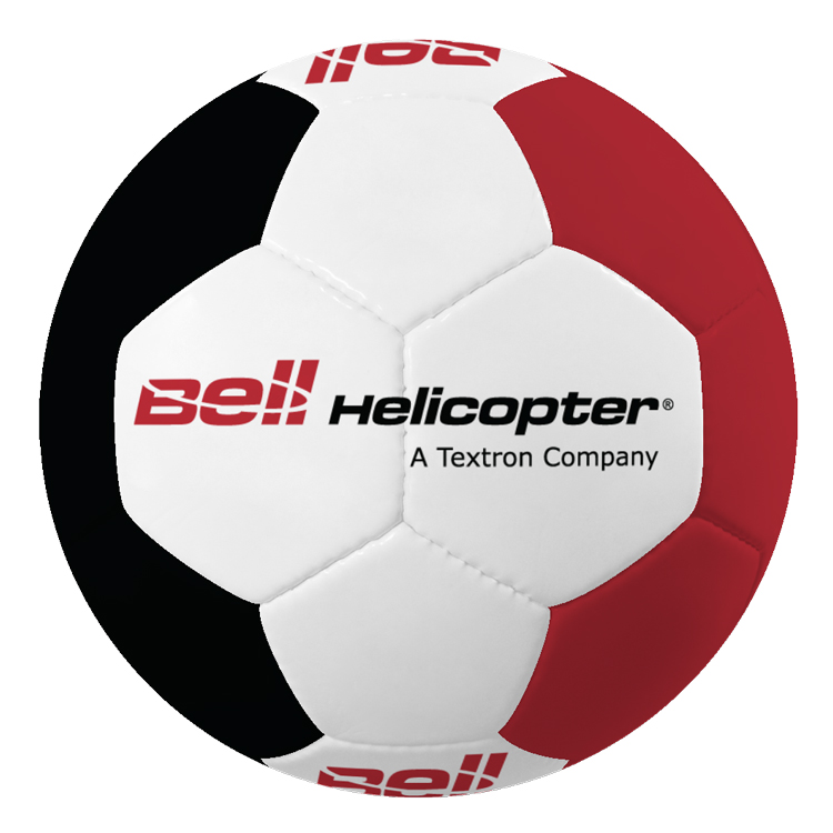
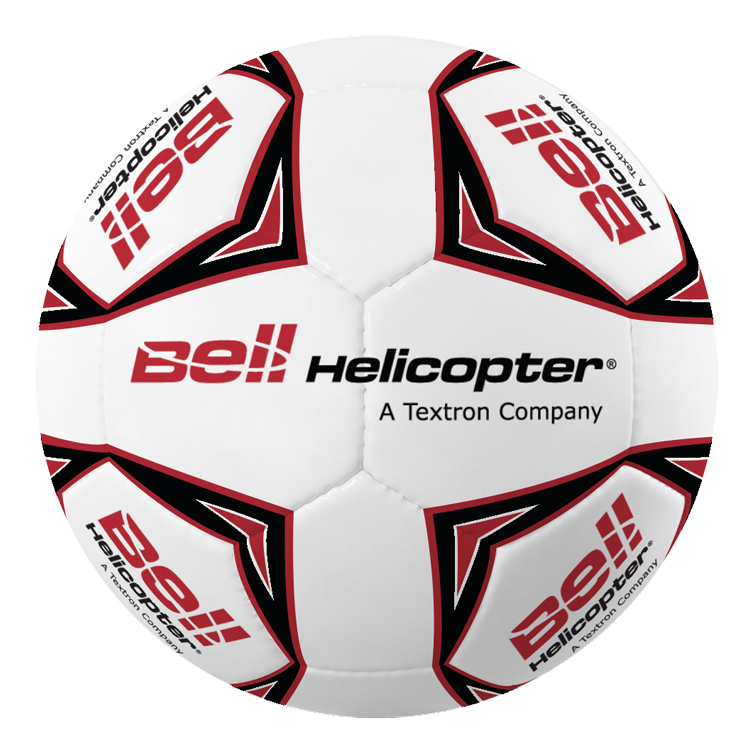
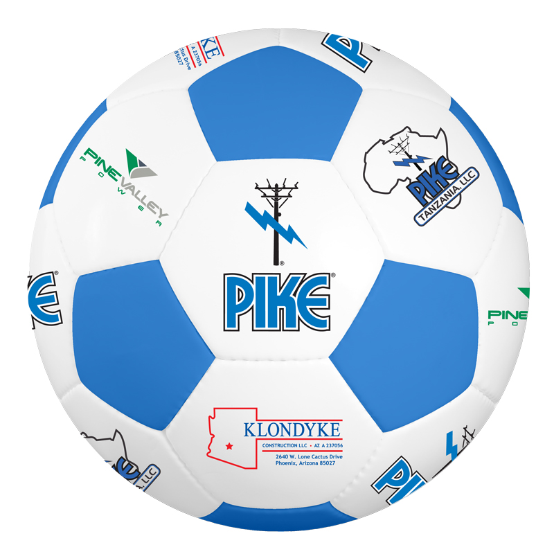
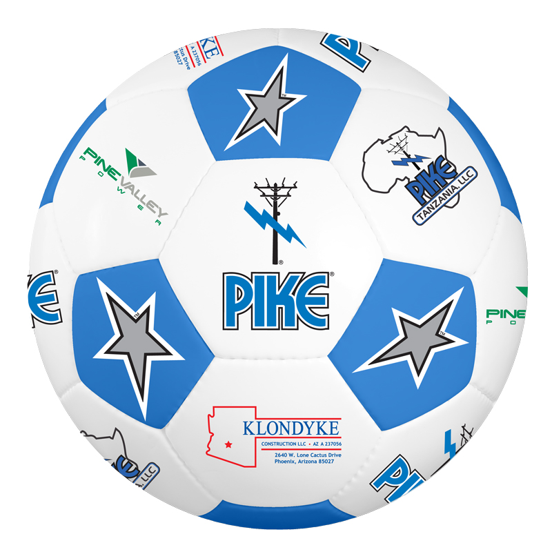
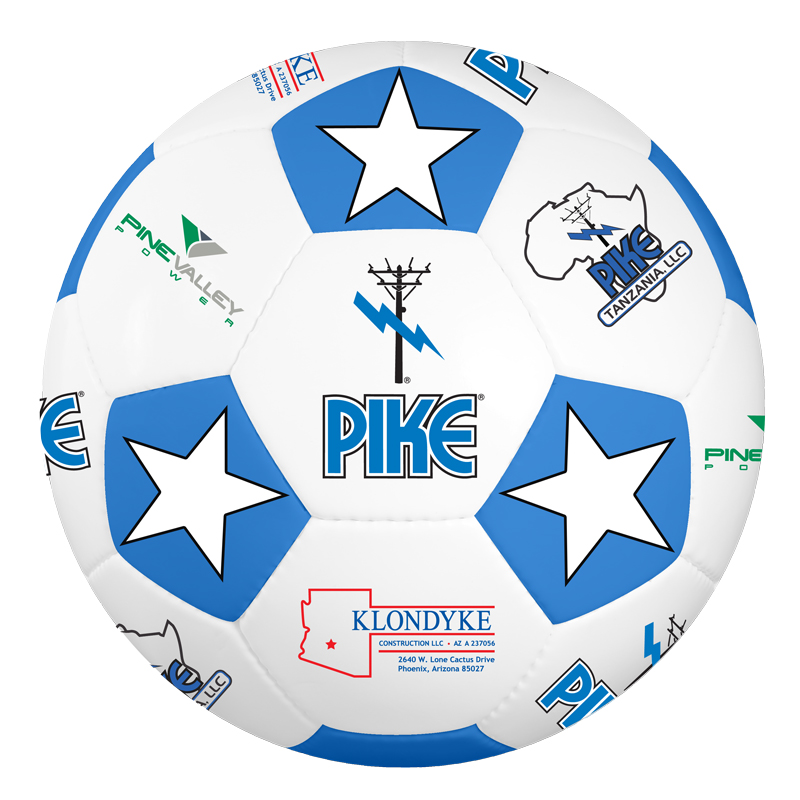
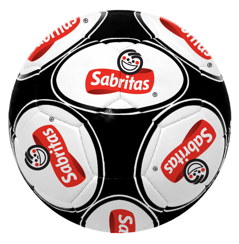
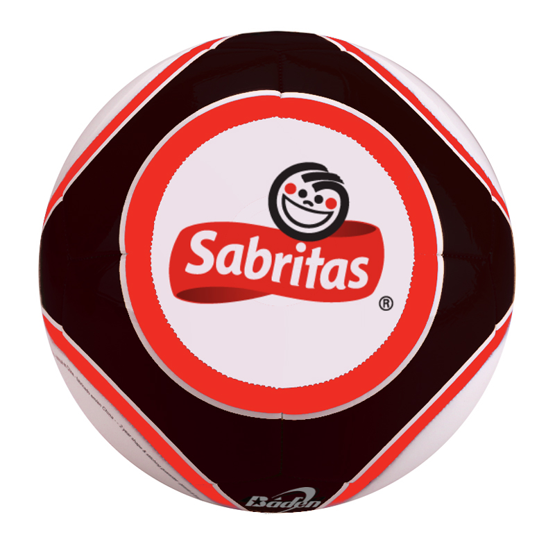
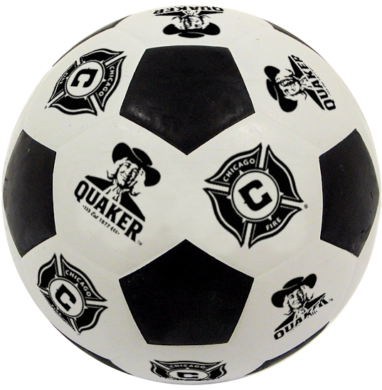
Created realistic product mockups that helped the sales team communicate design concepts more quickly, accelerating customer approvals while supporting both the sales and art departments.


Project Snapshot

OrganizationBaden Sports
RoleMarketing Coordinator
Timeframe2006 – 2012
Primary FocusVisual communication, product visualization, cross-functional collaboration
Audience* Promotional product customers
* Sales team
* Art department
Deliverables* Product mockups (“virtuals”)
* Customer approval proofs
* Design variations
* Logo visualization concepts
Tools* Adobe Photoshop
* Product artwork
* Brand guidelines

The Challenge

Our promotional products team often worked with customers who needed custom sports balls on tight deadlines. Before production could begin, customers needed to approve artwork, colors, and logo placement. While our art department produced the official production files, they also balanced many other priorities, creating delays that made it difficult for the sales team to respond quickly.

The sales team needed realistic visual proofs that customers could review and approve without waiting for the art department’s availability. Delays meant slower response times, longer sales cycles, and an increased risk of losing orders to competitors who could move more quickly.


My Approach

Although creating customer proofs wasn’t part of my role as Marketing Coordinator, I recognized an opportunity to help. Because I already worked closely with both the sales and art departments, I offered to learn their standards and create customer-ready mockups that complemented their existing workflow.

Before creating my first virtual, I learned the production requirements behind each design. Different printing methods had different limitations for artwork size, placement, and color selection, so consistency and accuracy were just as important as speed. My goal wasn’t simply to make designs look good, it was to create realistic representations that customers could confidently approve while remaining faithful to what could actually be manufactured.

The more I understood the production process, the more efficiently I could create virtuals that supported everyone involved. Sales representatives received proofs faster, customers had clearer expectations, and the art department had fewer interruptions while focusing on production-ready artwork.


What I Created

  • Customer-facing product mockups (“virtuals”)
  • Multiple logo and color variations
  • Realistic product visualizations
  • Promotional sports ball concepts
  • Production-aware design proofs
  • Marketing graphics supporting custom product sales

Results & Impact

While I didn’t formally track production metrics, this work became an important extension of the promotional product workflow.

The project helped:

  • Reduce turnaround time for customer proofs
  • Support a busy art department during peak workloads
  • Give sales representatives faster access to customer-ready visuals
  • Improve communication between sales, marketing, and design
  • Provide customers with realistic expectations before production
  • Build a scalable process that could support hundreds of custom product requests

Over time, creating these virtuals became another way I could contribute beyond my primary responsibilities while helping multiple departments work more efficiently.


My Process

Observe

I noticed that sales representatives were frequently waiting on artwork before they could move customer projects forward. The bottleneck wasn’t creativity it was capacity.

Understand the Goal

The objective wasn’t simply to create attractive mockups. It was to help customers make confident purchasing decisions while allowing the art department to focus on production work.

Remove the Friction

By learning the same production standards used by the art department, I was able to produce realistic virtuals that fit naturally into the existing approval process and reduced delays.

Design for People

The virtuals were designed for several audiences at once. Customers needed clear visual representations, sales representatives needed quick turnaround times, and the art department needed consistency with manufacturing requirements.

Measure Adoption

As more requests came my way, it became clear the process was providing value. The growing volume of virtuals demonstrated that the solution was helping teams work more efficiently.

Refine & Improve

Each project helped me become faster and more accurate. I developed a better understanding of production requirements, learned common customer preferences, and refined my workflow to deliver consistent results.


Featured Work Examples


Key Takeaways

This project reinforced that visual design is about far more than aesthetics. Effective design helps people make decisions, communicate ideas, and move projects forward.

It also reminded me that some of the most valuable contributions come from looking beyond your job description. By recognizing a bottleneck and learning enough about another team’s workflow to provide meaningful support, I was able to help sales, marketing, art, and ultimately our customers.

Looking back, this project represents something that’s become a consistent pattern in my career. I enjoy finding opportunities to help beyond the boundaries of my role, especially when I can make life easier for teammates or customers. Sometimes those contributions are highly visible, and other times they simply become part of how work gets done. Both are equally rewarding to me.

Improving Receptionist Workflows Through UX Research and Dashboard Design

I worked closely with a UX Designer on a receptionist dashboard project for dealerships. My role was to determine the key challenges dealership receptionists have and what content would be most relevant to them, then communicate this to a UX designer to bring the dashboard to life.

Having visited dealerships of all sizes across the country and speaking to their receptionists, as well as having worked at a dealership myself and previous front desk experience, I had direct knowledge of many of the challenges receptionists frequently face.

I also have read dealership reviews regularly over the past 7+ years to understand the customer experience. After all, customers typically leave reviews when they are ecstatic or disappointed about their experience. Whether or not the content is 100% true and accurate, being one-sided, it provides helpful insights as to what customers expect and what they actually get out of their dealership experience.

Receptionists often provide the dealership’s first impression, however they are often kept in the dark on key information that can help them provide an excellent experience for customers. Our goal with this project was to eliminate as many of these challenges as possible by displaying key information on a dashboard and providing quick access to helpful resources.


Challenges, Goals & Solutions

Below are some key challenges that dealership receptionists often face, our goals to accomplish with the receptionist dashboard, and the solutions we implemented in the design. Because the design is proprietary to the company for which we created this dashboard, no images will be displayed.

Keeping Up with Dealership Events and Promotions

Dealerships regularly have events that are communicated to customers via email, mail and social media, but oftentimes, this information is not shared with key dealership employees, including receptionists and salespeople. This often results in customers being more knowledgeable about dealership events than the employees, which can start the experience off negatively. If the receptionist or salesperson doesn’t know what’s going on at their own dealership, what else don’t they know?

Our goal was to provide an easy way to keep all dealership employees updated on events to avoid this snafu. If the dealership was having an event, we wanted to ensure the receptionist had the details to answer any questions customers had when calling or stopping by.

We accomplished this by incorporating a dealership events calendar in the dashboard so marketing and management could keep employees updated on current and future events, including event details, dates and times.

Preparing for Appointments

It’s common for dealerships to have several sales appointments daily, however appointments may not be in a location that receptionists have access to, such as the dealer’s CRM, and appointments can be generated and stored in multiple software programs. So even with CRM access, it’s likely the receptionist will not know who to expect each day. Some salespeople may tell the receptionist about their upcoming appointments, but generally, there is not a consistent way that appointments are communicated to the receptionist.

Imagine if this practice occurred at other businesses, such as doctor’s offices, banks or hair salons – wouldn’t you feel apprehensive if you went to a doctor appointment and the person at the front desk didn’t know who you were or who you were there to see? Purchasing a vehicle is a major investment and if you’ve been communicating with a dealership and have an appointment, at the very least, when you arrive for the appointment, you should be expected and treated as such.

When I worked at a Ford-Lincoln dealership, we would regularly have “Lincoln Academy” training sessions during which we would learn key customer experience best practices to provide our customers with the “Lincoln Experience.” Something that has stuck out in my mind over 5 years later is making the customer feel welcomed and expected, even saying the words “we’ve been expecting you” when they arrive.

Our goal was to communicate every appointment to the receptionist so when customers arrive for their appointment, they feel expected and valued, not like a stranger walking in off the street having their first experience with the dealership.

We accomplished this by incorporating an appointments module to the dashboard that displayed all of the day’s appointments with the customer’s name, the assigned salesperson and a button to quickly notify the salesperson that their appointment had arrived. This button would send a message through the built-in messaging tool available on desktop and mobile devices, so even if the salesperson was away from their desk, which is common, they could be alerted.

We also incorporated an indicator to notify reception if this was a return “VIP” customer or a new customer so they could adjust their conversation to suit the customer’s relationship with the dealership. A simple “welcome back” could make a huge difference in the customer’s experience and make them feel valued as a return customer, providing a more positive experience.

Saying the Right Thing

Phone scripts and email templates are common for many sales roles at dealerships, but when it comes to the first dealership employee many customers speak to – the receptionist – scripts are not very common. Part of providing an excellent experience is consistency in ensuring those speaking to customers have a shared message.

Since most dealerships have multiple receptionists and many work part-time, it’s important to ensure their conversations are consistent, from the initial greeting to answering questions. If you’ve seen pretty much any receptionist’s desk, you will see reminders, procedures and information posted in nearly every free space. This can lead to a cluttered look and put potentially confidential information in public view.

These scripts could provide the receptionist with what to say when there’s a major recall going on, event information, a special holiday greeting, or OEM-required greeting. This could even be used to document simple procedures, such as what to say when a customer calls in a complaint, what information to collect, and who to direct these customers to for resolution.

Our goal was to provide dealerships with a way to document all of these scripts and messages in a singular location where receptionists could easily access, without having to tape documents all around the desk area.

We accomplished this by incorporating a scripts tool at the top of the dashboard. A phone greeting could be pinned so it is always visible and additional scripts would be just a click away.

Who Works Here, Anyway?

Have you ever called a business to speak to an employee and the receptionist seemed unsure of who you were asking for or whether that person still worked at the business? It’s not a positive experience for the customer, especially if they’ve been recently communicating with that employee. Why doesn’t the receptionist know who they work with?

It’s no secret that dealerships have extremely high turnover rates, especially in sales. According to an NADA (National Automobile Dealers Association) report, overall dealership sales turnover ranges from 74-80% and short-term, 39% of salespeople are terminated in the first 90 days. For a receptionist, this means there’s always new faces and familiar faces often disappear quickly.

Additionally, non-sales inquiries can be the most daunting to a receptionist. They’re under the pressure of having to quickly come up with answers, but it can be challenging to know who does what at the dealership.

Our goal was to eliminate the questions of “does this person still work here” and “who does what around here” and instead, provide a crystal-clear directory so the receptionist could confidently answer questions for the customer and direct callers to the appropriate person, both key responsibilities of that role.

We accomplished this by incorporating an employee directory on the receptionist dashboard which included employee names, availability status, titles, departments and contact information so the receptionist could easily identify the correct person. The directory included a messaging button so the receptionist could instantly message the employee on a messaging platform available on web, desktop and mobile application, so regardless of whether the employee was at their desk or out and about around the dealership, they were reachable.

Keeping Personal and Professional Communication Separate

I’ve mentioned a messaging platform in a few of the examples above and I believe it is a key feature for dealerships to keep work-related content on a messaging platform that does not require employees to text each other from their personal devices. This has several benefits, one being that this keeps communication between employees on a dealership-controlled messaging platform.

An example I will never forget was when a salesperson asked the receptionist to text him when his customer came in. This is not an uncommon occurrence. The receptionist didn’t feel super comfortable sharing her phone number with the salesperson, but did as he asked when the customer arrived. The following weekend, the receptionist received some inappropriate late night text messages from the salesperson. It was then that she vowed to never share her personal number with a salesperson again.

In general, nearly 88% of receptionists are female, and in automotive, women represent only 19% of dealership employees, so there’s a significant gender imbalance. This can be an intimidating environment for women to work in and has potential for harassment cases. In fact, according to the Equal Employment Opportunity Commission, 76 harassment charges are filed with the EEOC daily and defense and settlement costs average $125,000 per claim.

If questionable communication is on employee personal devices, it can also be much more difficult for a dealership to legally gain access to, if needed for a complaint. By keeping communication on a workplace-controlled messaging platform and off of employees’ personal devices, this can help reduce the chances of this happening and provide a way for dealerships to have documentation if it does occur.

Our goal to assist in separating personal from professional communication was to eliminate the need for receptionists to use their personal cell phones to text coworkers by providing easy access to a dealer-controlled communication platform.

We accomplished this by including a messaging module on the dashboard as well as messaging functionality by every employee’s name so that the receptionist could start a conversation with one click.


Conclusion

Working with a UX designer, we were able to concept and design a receptionist dashboard that would address the key challenges dealership receptionists face every day. By providing easy access to a dealership-controlled messaging platform, receptionists could easily message coworkers with the click of a button and not have to share their personal information with coworkers through texting. And by placing the most pertinent information in a singular location, receptionists would no longer need to tape reminders and potentially confidential information around their desk, risking it being in view of customers.


Designing a Home Inventory Mobile App for Everyday Users

An independent UX and product design project exploring how a thoughtfully designed mobile application could simplify home inventory management while supporting homeowners, renters, and property managers.


Project Snapshot

OrganizationIndependent UX & Product Design Project
RoleUX Designer, Product Designer & Researcher
Timeframe2020
Primary FocusMobile application design, UX research, product strategy, information architecture
Audience* Homeowners
* Renters
* Property managers
* Individuals documenting possessions for insurance purposes
Deliverables* Product concept
* UX research
* Mobile app wireframes and mockups
* User workflows
* Feature roadmap
* Subscription model
* Product presentation
Tools* Adobe XD
* PowerPoint
* Competitive research

The Challenge

Home inventory applications already existed, but many felt either overly complicated, too limited, or focused on only a portion of the user’s needs. Reviews frequently mentioned missing features, confusing navigation, or difficulty maintaining an accurate inventory over time.

I wanted to explore what a more complete solution might look like. Rather than simply recreating another inventory app, I challenged myself to design an experience that could grow with users throughout different stages of life – from renting an apartment to owning multiple properties – while remaining approachable for someone documenting their belongings for the first time.


My Approach

I began by researching existing home inventory applications, reading feature comparisons, customer reviews, and articles discussing insurance documentation and property management. Rather than focusing on what each application did well individually, I looked for patterns. Which features appeared repeatedly? What frustrations kept surfacing? Where were opportunities to combine the best ideas into a more cohesive experience?

One design principle guided nearly every decision: powerful doesn’t have to mean complicated. I like to begin by imagining the ideal end state – the experience I would ultimately want users to have – then work backward to determine which features deliver the most value first. That approach helps create software that feels cohesive today while leaving room for thoughtful growth tomorrow.

I also approached the project from a long-term product perspective. Instead of designing only an initial release, I imagined what the product could eventually become. From there, I worked backward to identify features that would create immediate value while supporting future growth through additional functionality and subscription options.


What I Created

  • Mobile application concept
  • User research and competitive analysis
  • Information architecture
  • Navigation structure
  • Mobile interface mockups
  • User onboarding experience
  • Guided setup checklist
  • Context-sensitive help system
  • Inventory management workflows
  • Subscription model for multiple user types
  • Product vision presentation

Results & Impact

Although this project was never developed into a production application, it demonstrates my ability to think beyond interface design and consider the broader product experience.

The project showcases my ability to:

  • Conduct competitive product research
  • Translate research into product features
  • Organize complex information into intuitive workflows
  • Design scalable information architecture
  • Consider business strategy alongside user experience
  • Create interfaces that balance simplicity with flexibility

My Process

Observe

I started by studying existing home inventory applications, customer reviews, and industry articles to understand where users struggled and which features they valued most.

Understand the Goal

The goal wasn’t simply to create another inventory app. It was to design a solution that people could continue using as their homes, belongings, and responsibilities changed over time.

Remove the Friction

I simplified navigation, organized information into logical categories, introduced guided setup, and provided contextual help so users wouldn’t feel overwhelmed by the amount of information they could manage.

Design for People

Every design decision centered on making a feature-rich application feel approachable. I wanted new users to get started quickly while still providing advanced functionality for users with more complex needs.

Measure Adoption

Although the application wasn’t released, I evaluated design decisions by asking whether each feature added meaningful value or unnecessary complexity. User reviews of competing products served as valuable validation throughout the design process.

Refine & Improve

The project evolved continuously as research uncovered additional opportunities. Rather than designing isolated screens, I refined the overall experience to create a cohesive product that could grow with its users.


Work Samples

This project includes:

  • Product vision presentation
  • UX research summary
  • Competitive feature analysis
  • Mobile app mockups
  • User flows
  • Navigation concepts
  • Subscription model
  • Feature planning
  • Interface walkthroughs

Key Takeaways

Designing software from scratch requires balancing user needs, business goals, and technical feasibility long before development begins. This project reinforced the value of thorough research, thoughtful information architecture, and planning for long-term product growth rather than only the initial release.

It also strengthened my understanding that successful products aren’t defined by the number of features they include, but by how naturally those features fit into the user’s workflow.

Redesigning an Unemployment Benefits Portal to Reduce User Friction

Note: This is an independent redesign project created for portfolio purposes and is not affiliated with or endorsed by the State of Missouri. The goal was to analyze an existing user experience and demonstrate my approach to improving usability through thoughtful, user-centered design.

An independent UX redesign project that reimagined a confusing government unemployment portal with a stronger focus on usability, clarity, and helping users complete critical tasks with confidence.


Project Snapshot

OrganizationIndependent UX Design Project (Missouri Unemployment Portal)
RoleUX Designer & Researcher
Timeframe2020
Primary FocusUser experience design, information architecture, usability improvements
AudienceJob seekers navigating the unemployment claims process
Deliverables* UX evaluation
* Website redesign concepts
* Desktop and mobile interface mockups
* Design rationale presentation
Tools* Adobe XD
*PowerPoint

The Challenge

After being laid off during the COVID-19 pandemic, I visited my state’s unemployment website to understand what steps I would need to take if I needed to file a claim. Although I was fortunate not to rely on unemployment for long, I immediately noticed how difficult the site was to navigate. Important tasks were buried, terminology wasn’t always clear, and I often found myself wondering whether I was completing the correct steps.

This project became an opportunity to examine the experience through the eyes of a first-time user. People visiting an unemployment website are often already under significant stress, so every unnecessary obstacle increases frustration and uncertainty. I wanted to explore how thoughtful UX design, clearer language, and better organization could make the experience more approachable and easier to navigate.


My Approach

Rather than starting with visual design, I first walked through the website as though I were a new user trying to complete common tasks. I documented every point where I hesitated, became confused, or needed additional information before continuing.

As I redesigned each screen, I focused on reducing cognitive load rather than adding new features. I looked for opportunities to make important tasks easier to discover, replace technical language with more familiar terminology, and provide helpful guidance before users encountered confusion.

Having recently completed formal training in Adobe XD while collaborating with product and UX teams, this project also gave me an opportunity to apply those skills independently and demonstrate how user-centered design can improve even familiar workflows.


What I Created

  • Comprehensive usability review of the existing unemployment portal
  • Desktop and mobile redesign concepts
  • Improved navigation and information architecture
  • Integrated job search concept within the portal
  • More prominent work search activity log
  • Contextual help text for complex questions
  • Simplified, user-friendly navigation labels
  • Redesigned profile and account management experience
  • Presentation documenting usability issues alongside proposed solutions

Results & Impact

Although this was an independent concept project rather than a production implementation, it demonstrates my approach to identifying usability challenges and designing practical improvements.

The redesign focused on:

  • Making critical tasks easier to locate
  • Reducing confusion through clearer language
  • Improving navigation for first-time users
  • Supporting both desktop and mobile experiences
  • Demonstrating user-centered design thinking
  • Presenting design decisions with clear supporting rationale

My Process

Observe

I approached the website as a first-time user, documenting every moment of uncertainty, hesitation, or unnecessary effort required to complete common tasks.

Understand the Goal

Users weren’t visiting the site to explore; they needed to accomplish important tasks quickly during a stressful time. Every design decision needed to support that goal.

Remove the Friction

I simplified navigation, surfaced commonly used features, clarified terminology, and introduced contextual guidance where users were likely to have questions.

Design for People

Rather than assuming users understood government terminology or internal processes, I designed around plain language, clear organization, and predictable interactions.

Measure Adoption

Although this project wasn’t implemented, I evaluated each redesign decision by asking whether it reduced effort, improved discoverability, or made the overall experience more intuitive.

Refine & Improve

Each screen went through multiple iterations as I continued identifying opportunities to simplify workflows and improve the overall user experience.


Work Samples

This project includes:

  • Original website screenshots
  • Annotated UX evaluations
  • Desktop redesign mockups
  • Mobile redesign mockups
  • Before-and-after comparisons
  • Design rationale and explanations for each improvement

Key Takeaways

This project reinforced that effective UX design begins with empathy. People rarely approach software with the same understanding as the teams who build it, especially during stressful situations. By observing the experience from the user’s perspective and questioning every point of friction, small design changes can have a meaningful impact on usability and confidence.

It also strengthened my ability to communicate why design changes matter—not just what should change. Every recommendation was supported by a specific usability issue and a clear explanation of how the redesign addressed it.

Leading a Lean Manufacturing Initiative to Improve Cross-Department Operations

Applied Lean Manufacturing principles to redesign operational workflows, improve efficiency, and standardize processes while helping lay the foundation for more consistent day-to-day operations.


Project Snapshot

OrganizationBaden Sports
RoleOperations
Timeframe2007
Primary FocusProcess improvement, Lean Manufacturing, workflow optimization
Audience* Operations team
* Sales department
* Manufacturing
* Customer service
* Leadership
Deliverables* Process maps
* Workflow redesigns
* Standardized procedures
* Lean improvement recommendations
* Documentation
* Operational improvements
Tools* Lean Manufacturing principles
* Process mapping
* Microsoft Office
* Cross-functional collaboration

The Challenge

As Baden Sports continued to grow, many operational processes had developed organically over time. While employees worked hard to keep orders moving, some workflows contained unnecessary steps, duplicated effort, or inconsistencies that slowed production and made training more difficult.

Around this time I had recently completed my MBA, where Lean Manufacturing principles had been a significant area of study. When the opportunity arose to participate in process improvement efforts within Operations, I was excited to apply those concepts in a real manufacturing environment.

The goal wasn’t simply to work faster, it was to understand how work moved through the organization, identify unnecessary friction, and create processes that were easier for employees to follow while supporting long-term operational consistency.


My Approach

Rather than assuming a process needed to change because it looked inefficient, I spent time understanding why it existed in the first place. Every step had usually been added for a reason, even if that reason was no longer relevant.

I observed how work moved between departments, spoke with the people performing the work every day, and looked for opportunities to eliminate unnecessary motion, reduce duplicate effort, and simplify decision making. Many of the best ideas came from the employees closest to the work, so collaboration became an important part of the improvement process.

One lesson quickly became clear: the people performing the work every day often had the best ideas for improving it. Instead of designing processes in isolation, I looked for opportunities to simplify repetitive tasks, eliminate unnecessary steps, and standardize work where it made sense.

Throughout the project, I focused on improving the overall workflow rather than optimizing individual departments. Small improvements across multiple stages could create a much larger impact than solving a single isolated problem.


What I Created

  • Process documentation
  • Workflow analyses
  • Process maps
  • Lean improvement recommendations
  • Standardized operational procedures
  • Cross-functional process improvements
  • Operational documentation
  • Continuous improvement initiatives

Results & Impact

This initiative helped establish more consistent operational processes while reinforcing the value of continuous improvement throughout the organization.

The project contributed to:

  • More standardized workflows
  • Reduced process variation
  • Better operational consistency
  • Improved communication between departments
  • Easier knowledge sharing
  • Greater awareness of Lean principles within daily operations

Perhaps more importantly, it shaped the way I think about solving problems. Rather than accepting inefficiencies as “just the way things are,” I learned to view every workflow as something that could be observed, questioned, and thoughtfully improved.


My Process

Observe

Before suggesting changes, I spent time understanding how work actually flowed through the organization. Watching people perform their daily responsibilities often revealed opportunities that weren’t obvious from written procedures alone.

Understand the Goal

The objective wasn’t simply to make people work faster. It was to improve the entire process so information moved more efficiently between departments, making processes easier to follow, easier to teach, and more consistent over time.

Remove the Friction

Using Lean principles, I looked for opportunities to reduce unnecessary steps, eliminate duplication, and simplify workflows without sacrificing quality.

Design for People

The best processes are the ones people naturally want to follow. I focused on creating improvements that fit the way employees actually worked rather than expecting employees to adapt to complicated procedures.

Measure Adoption

Successful improvements became part of the team’s everyday workflow. Standardization helped create more predictable results while making future training and knowledge transfer easier.

Refine & Improve

Lean Manufacturing taught me that process improvement is never truly finished. Every improvement creates an opportunity to observe again, learn more, and continue refining the system.


Key Takeaways

This project fundamentally changed how I think about improving organizations. I learned that the best solutions rarely come from making one task dramatically better; they come from understanding how an entire system works and identifying opportunities to remove friction throughout the process.

It also reinforced something that has remained consistent throughout my career: the people doing the work every day often have the most valuable insights. Taking time to observe, listen, and understand their challenges almost always leads to better solutions than designing improvements from a distance.

Perhaps most importantly, this experience showed me that process improvement isn’t really about processes, it’s about people. Every unnecessary step removed gives someone more time to focus on work that creates value.


Featured Work Samples

Two of the largest initiatives that grew out of this work are featured below:

Standardizing Customer Service Processes to Improve Consistency and Coverage

Standardized customer service processes across multiple representatives to improve consistency, strengthen knowledge sharing, and ensure customers received the same high-quality experience regardless of who assisted them.


Project Snapshot

OrganizationBaden Sports
RoleOperations
Timeframe2007
Primary FocusProcess improvement, documentation, knowledge transfer, change management
AudienceCustomer Service Representatives, Customer Service Manager, Operations Leadership
Deliverables* Standardized customer service workflows
* Process documentation
* Cross-training documentation
* Role responsibilities
* Updated service procedures
Tools* Microsoft Office
* Lean Manufacturing principles
* Process mapping
* Team workshops

The Challenge

As part of Baden Sports’ Lean Manufacturing initiative, I worked with the customer service department to better understand how work was being completed. One of the first things I discovered was that each customer service representative had developed their own way of handling many common situations. While every employee had good intentions, years of experience had naturally led them to develop different processes, documentation, and decision-making approaches.

This inconsistency created several challenges. Customers often received different experiences depending on who answered the phone. Employees became difficult to back up during vacations or absences because much of their knowledge existed only in their own documentation or in their heads. The department was also divided by geographic territories, making it harder for customers to receive immediate assistance if their assigned representative was unavailable.

Although changing these processes created understandable concerns among the team, it also presented an opportunity to build a more resilient organization while improving the overall customer experience.


My Approach

Rather than assuming one person’s process was “correct,” I wanted to understand why each representative worked the way they did. I collected the documentation each employee had created, compared the similarities and differences, and met with employees and leadership to understand the reasoning behind each variation.

Many differences existed because employees had found solutions that worked well for their particular customers. Instead of discarding those ideas, we combined the strongest elements from everyone’s processes into a single standardized workflow that reflected the team’s collective experience.
Throughout the project, I focused on helping employees understand that the goal wasn’t to eliminate their individuality or relationships with customers. The goal was to create consistent service while making it easier for everyone to support one another. When the conversation shifted from changing people to improving the customer experience, the team became much more receptive to the new approach

What I Created

  • Standardized customer service workflows
  • Consolidated process documentation
  • Cross-training documentation
  • Clearly defined role responsibilities
  • Consistent customer service procedures
  • Shared departmental knowledge base
  • Documentation to support backup coverage during absences

Results & Impact

  • Standardized customer service across the department
  • Improved consistency regardless of which representative assisted a customer
  • Reduced reliance on individual employees’ institutional knowledge
  • Improved vacation and absence coverage
  • Made cross-training significantly easier
  • Preserved organizational knowledge through documentation
  • Increased confidence that critical tasks could continue uninterrupted

My Process

Observe

I spent time understanding how each representative actually completed their work rather than relying solely on existing documentation.

Understand the Goal

The objective wasn’t simply to standardize processes, it was to create a better and more consistent experience for both customers and employees.

Remove the Friction

I identified unnecessary differences between workflows and consolidated them into clear, repeatable processes that anyone on the team could follow.

Design for People

The new documentation respected employees’ expertise while making it easier for others to step in when needed.

Measure Adoption

I worked closely with leadership and the customer service team to refine documentation and answer questions throughout implementation.

Refine & Improve

The final processes represented the best ideas from multiple employees rather than one person’s preferred method.


Key Takeaways

  • Standardization should preserve good ideas rather than erase them.
  • Documentation is one of the most effective forms of organizational knowledge transfer.
  • Consistency builds trust for customers and employees alike.
  • The most successful process improvements begin by listening to the people doing the work.
  • Change is easier to embrace when people understand how it benefits everyone.

Redesigning Order Processing to Improve Speed, Accuracy, and Adoption

Redesigned the order processing workflow by empowering employees, streamlining approvals, and removing manual bottlenecks to create a faster, more efficient process from order entry to fulfillment.


Project Snapshot

OrganizationBaden Sports
RoleOperations
Timeframe2007
Primary FocusWorkflow redesign, operational efficiency, organizational adoption
AudienceSales Representatives, Sales Assistants, Customer Service, Accounting, Supply Chain, Warehouse
Deliverables* Redesigned order workflow
* Updated operating procedures
* Training materials
* Process documentation
* Reporting improvements
* Workflow automation recommendations
Tools* Microsoft Navision
* Microsoft Office
* Process mapping
* Lean Manufacturing principles
* Reporting tools

The Challenge

The existing order process had grown organically over many years. Sales representatives completed paper or Excel order forms before sending them to an order entry team, who manually entered information into Microsoft Navision. If a new product needed to be created or payment required additional review, orders could sit idle while paperwork moved between multiple departments.

The process relied heavily on manual handoffs, printed paperwork, and employees physically walking documents throughout the building. Every additional step increased the likelihood of delays, duplicate work, and missed opportunities. As the company continued to grow, these inefficiencies became more noticeable and increasingly difficult to manage.

The goal wasn’t simply to make people work faster, it was to redesign the process so work naturally flowed to the right people at the right time


My Approach

Before recommending changes, I mapped the complete lifecycle of an order from the moment it was received until it reached the warehouse. Looking at the entire process revealed where work was stopping, why employees were waiting on one another, and where technology could eliminate unnecessary manual steps.

Rather than simply moving responsibilities from one department to another, we looked for opportunities to empower employees. Sales representatives were trained to enter their own orders, additional system licenses removed technology bottlenecks, permissions were expanded where appropriate, and automated reporting reduced the need for manual follow-up.

Like any significant change, this required thoughtful adoption. We brought the sales team together for hands-on training, answered questions, demonstrated the benefits, and continued supporting employees after implementation to ensure everyone felt comfortable with the new process.


What I Created

  • Redesigned end-to-end order processing workflow
  • Updated operational procedures
  • Sales training materials
  • Process documentation
  • Workflow diagrams
  • Automated reporting recommendations
  • Cross-functional implementation support
  • Change management and adoption planning

Results & Impact

  • Reduced manual handoffs between departments
  • Empowered sales representatives to enter their own orders
  • Accelerated order processing
  • Improved communication between departments
  • Reduced unnecessary waiting for approvals
  • Added safeguards to prevent missed orders
  • Improved visibility throughout the order lifecycle
  • Increased employee ownership of the process
  • Supported role transitions without workforce reductions

My Process

Observe

I mapped the complete order lifecycle to understand where delays, bottlenecks, and unnecessary work occurred.

Understand the Goal

The objective wasn’t simply to speed up order entry, it was to create a process that was more reliable, scalable, and easier for everyone involved.

Remove the Friction

Whenever possible, I eliminated manual handoffs, reduced waiting, and leveraged technology to automate repetitive tasks.

Design for People

New processes were designed to give employees more ownership while reducing frustration and making their work easier.

Measure Adoption

Training sessions, ongoing support, and employee feedback helped ensure the new workflows became part of everyday operations.

Refine & Improve

As employees became comfortable with the new system, we continued refining procedures and identifying additional opportunities for improvement.


Key Takeaways

  • The best process improvements eliminate unnecessary work rather than asking people to work harder.
  • Technology is most valuable when it removes friction instead of adding complexity.
  • Change management is just as important as process design.
  • Giving employees ownership often increases both adoption and accountability.
  • The strongest solutions improve the experience for employees and customers at the same time.

Building a Community Marketing Campaign That Increased Local Food Bank Donations

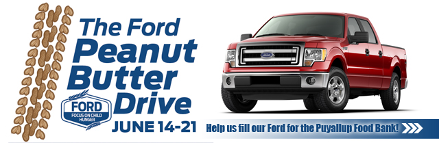
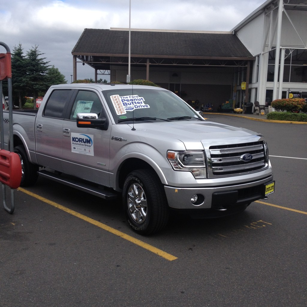
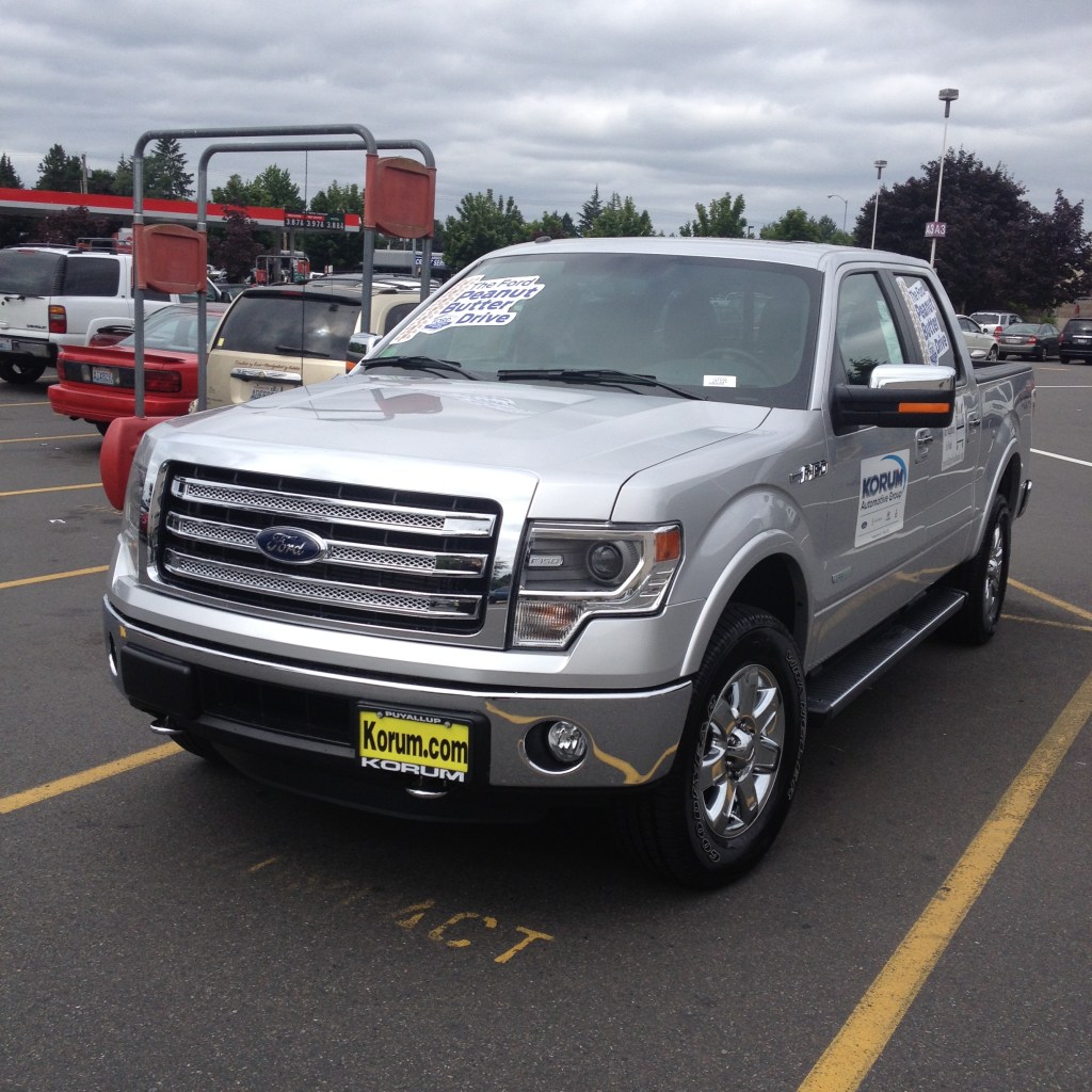
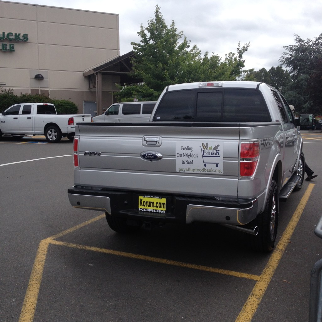
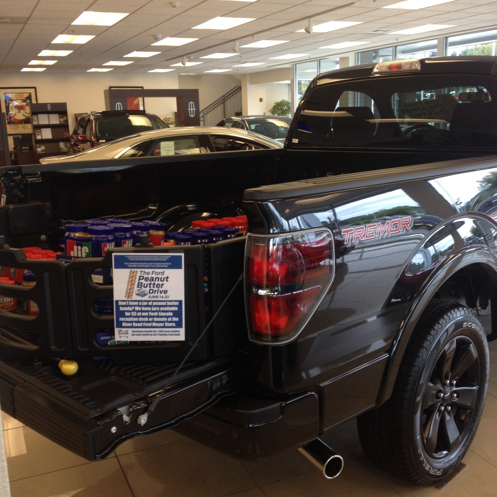
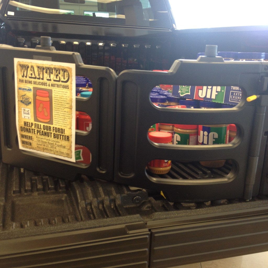
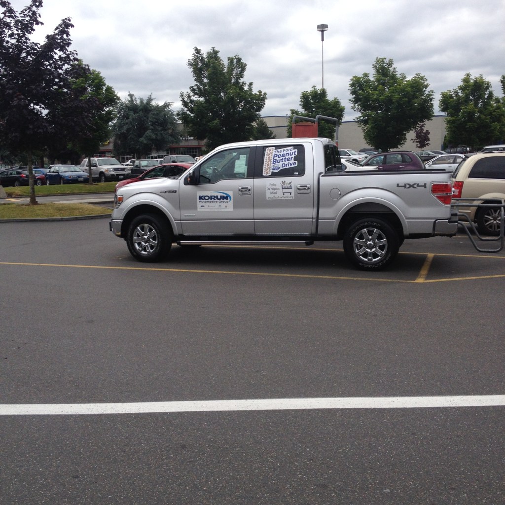
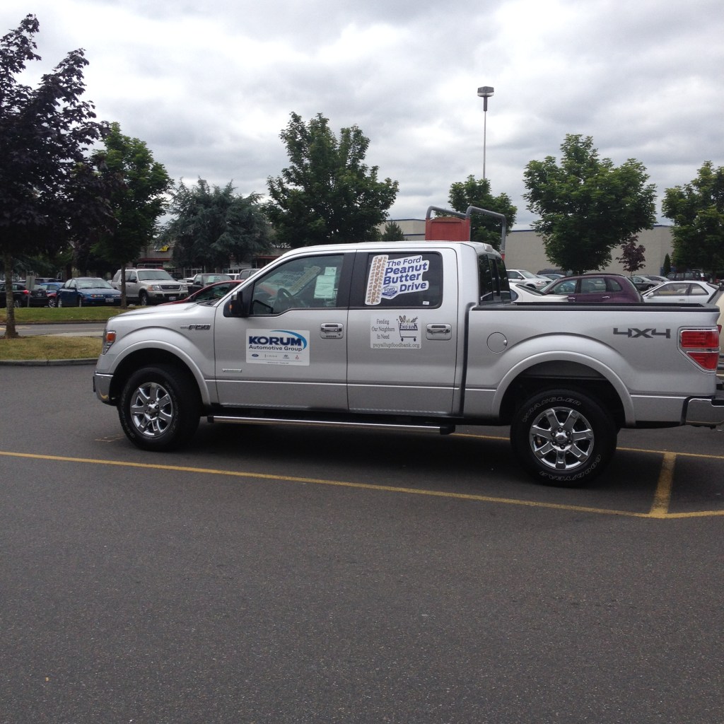
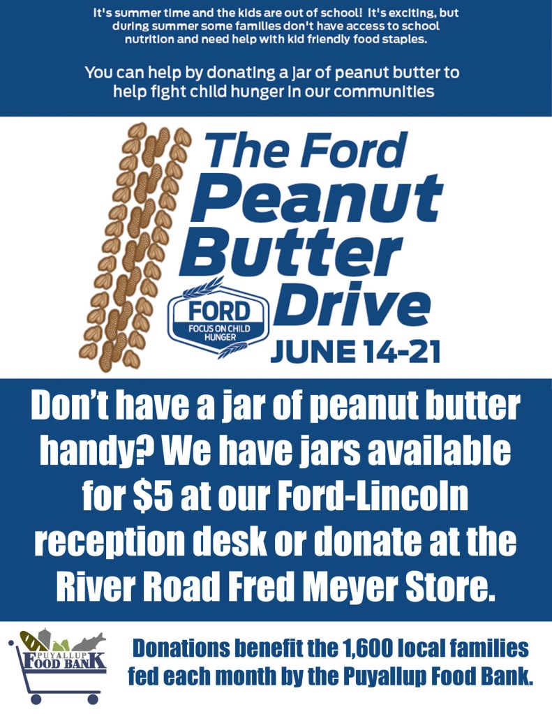
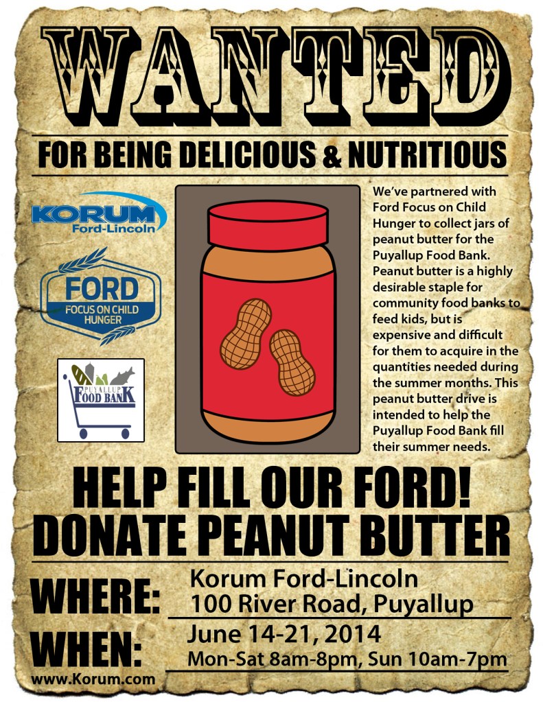
In June 2014, our dealership partnered with Ford’s Focus on Hunger initiative and the Puyallup Food Bank to collect peanut butter for local families during the summer months, when food donations are often in high demand.

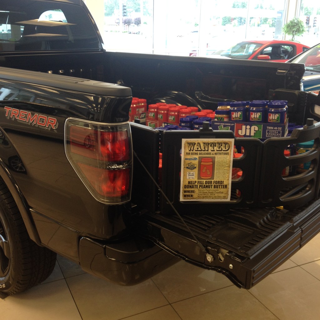
Although I received only a few days’ notice before the campaign began, we quickly brought together a coordinated marketing effort that combined dealership signage, website updates, social media, employee communication, community partnerships, and in-store promotions. The goal was simple: make donating as easy as possible while raising awareness of an important community need.

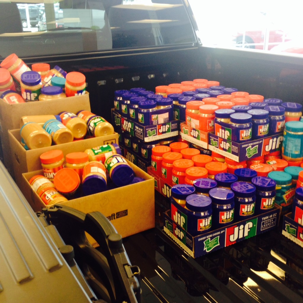
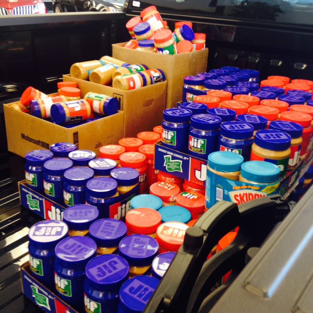
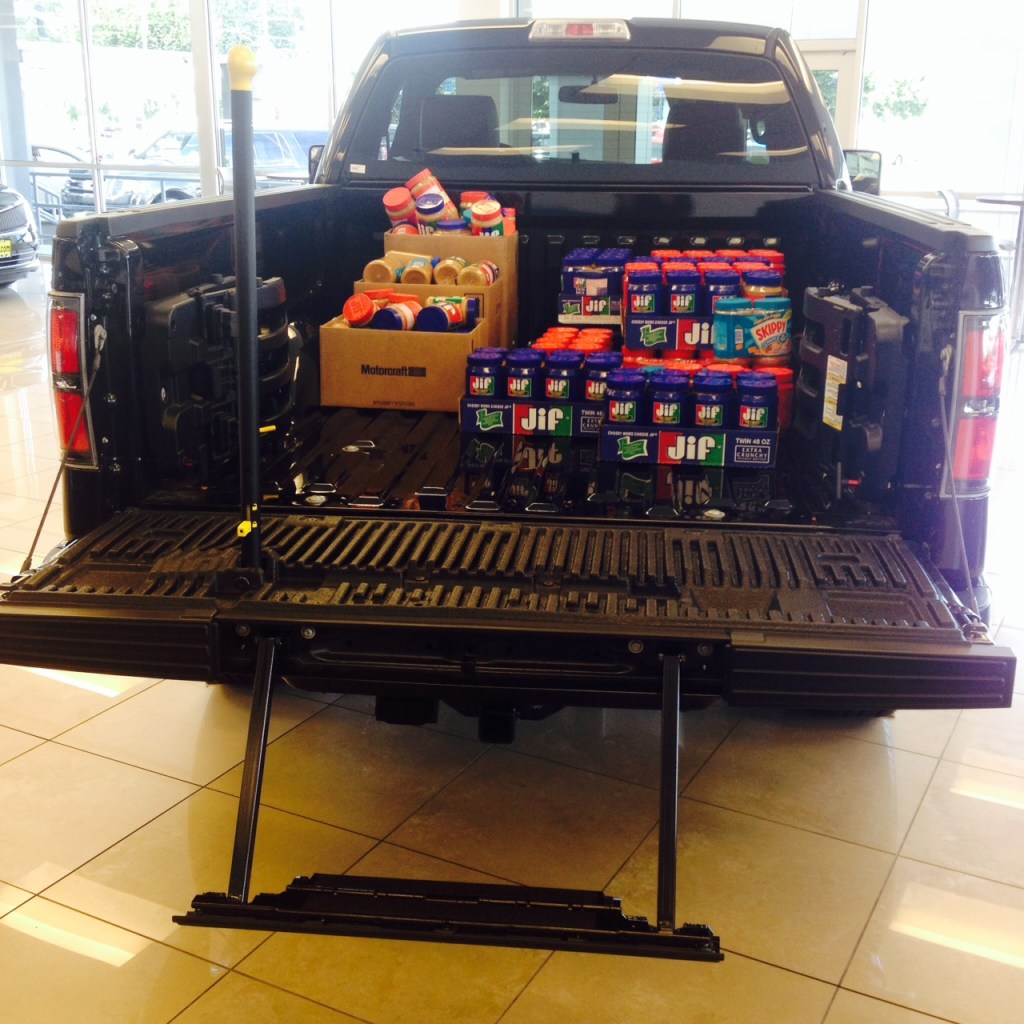
By the end of the campaign, we collected 535 jars of peanut butter to help support families served by the Puyallup Food Bank.

Campaign Assets

This campaign included a coordinated collection of marketing materials designed to create a consistent experience across every customer touchpoint.

Digital

  • Homepage website banner
  • Dedicated landing page
  • Facebook Event
  • Facebook posts throughout the campaign
  • Employee email announcements
  • Employee results and thank-you email

In-Store

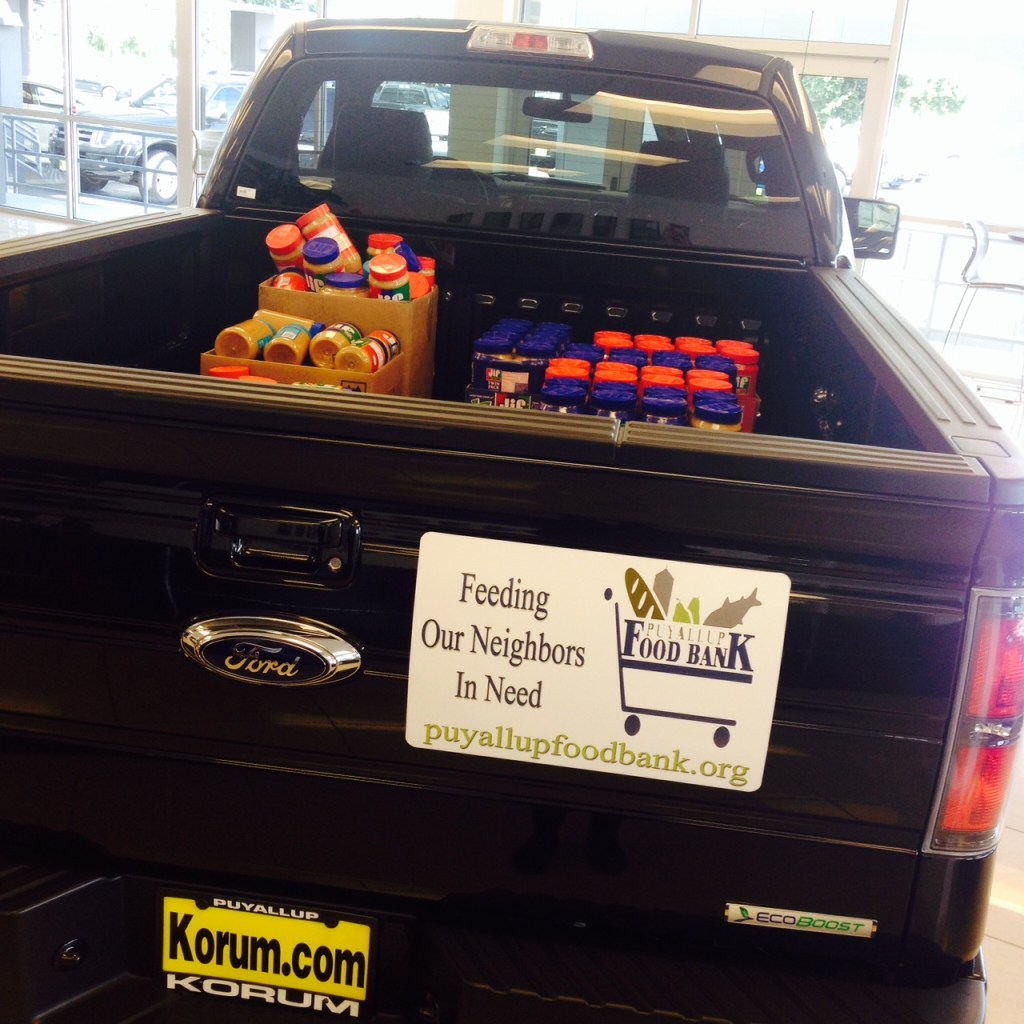
  • Showroom F-150 display
  • Event posters throughout the dealership
  • Reception donation station
  • Promotional signage

Community Partnership

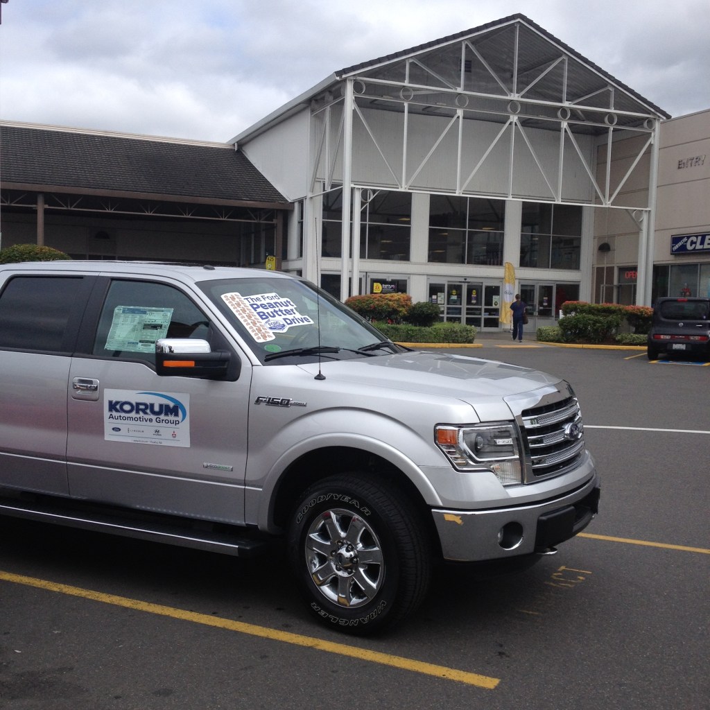
  • Promotional truck displayed at Fred Meyer
  • Point-of-sale signage at grocery store check stands
  • Peanut butter displays at every register

My Role

As Marketing Specialist, I coordinated the dealership’s marketing efforts for the campaign while adapting Ford-provided promotional assets to fit our local market and timeline.

Because the campaign was communicated to me only a few days before launch, speed and organization were critical. I updated our website, created the landing page, built the Facebook event, designed supporting promotional materials, coordinated employee communications, documented the campaign schedule, and assembled everything into a cohesive plan that could be easily followed by dealership staff.

I also documented the entire campaign – including timelines, marketing assets, and results – to serve as a reference for future community events.


How Everything Worked Together

Rather than treating each marketing piece as a standalone item, I focused on creating a connected experience that made it easy for people to learn about the event and participate, regardless of how they first encountered it.

Consistent Branding

Ford supplied campaign graphics that established the visual identity for the event. I carried those design elements across our website, social media, dealership signage, and employee communications so customers encountered a familiar look throughout the campaign.

Consistent Messaging

Every touchpoint explained the same core message:

  • why peanut butter was being collected,
  • who it would help,
  • where donations could be made,
  • and how easy it was to participate.

Whether someone visited our website, saw a Facebook post, walked into the dealership, or shopped at Fred Meyer, they received the same clear information.

Consistent Timing

The campaign followed a structured communication schedule that kept employees informed before, during, and after the event.

Planning documentation included milestones for:

  • launching marketing materials
  • showroom setup
  • grocery store promotion
  • donation collection
  • event conclusion
  • food bank delivery
  • employee follow-up

Having this schedule documented helped ensure everyone understood what was happening and when.

Internal Communication

One lesson I learned early in my marketing career was that successful campaigns don’t stop with customer-facing materials; employees need to understand the campaign just as well as customers do.

Throughout the event, I kept dealership staff informed with email updates and shared campaign materials so receptionists, salespeople, managers, and service advisors could confidently answer questions and encourage participation.

That internal communication helped create a seamless experience for customers while ensuring the dealership presented a unified message.


Campaign Results

  • Coordinated and launched a complete community awareness campaign within only a few days of receiving project information
  • Produced consistent messaging across digital, social, and in-person channels
  • Supported a partnership between Ford, the dealership, Fred Meyer, and the Puyallup Food Bank
  • Collected 535 jars of peanut butter
    • 321 donated through Fred Meyer
    • 214 donated through the dealership
  • Created reusable campaign documentation for future community outreach initiatives

Campaign Gallery

Campaign Overview Documentation

Web Banner

Fred Meyer Store & Dealership Showroom Promotion

Posters & Signage


Campaign Journey

Facebook Post

Website Landing Page

Visit Dealership or Fred Meyer

Donate Peanut Butter

Food Bank Receives Donations

Community Benefits

Coordinating a Multi-Channel Automotive Sales Campaign

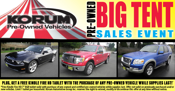
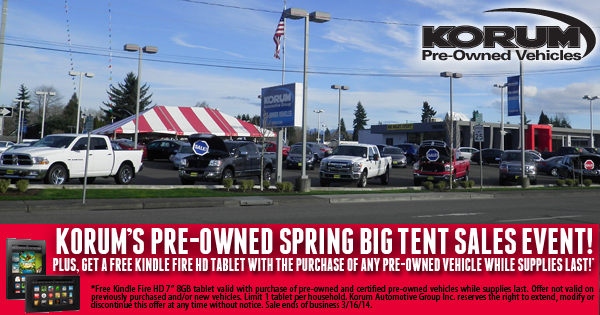
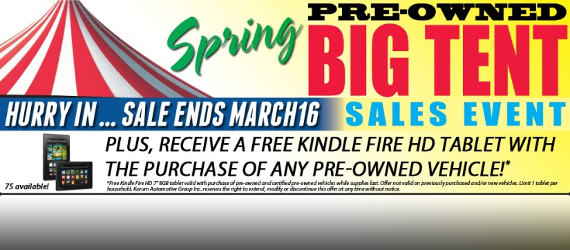
To promote our Spring Big Tent Sales Event, I coordinated a multi-channel marketing campaign designed to create a consistent customer experience across digital, print, television, social media, and in-store promotions.

Rather than treating each piece of marketing independently, I focused on ensuring every customer touchpoint reinforced the same message while making it as easy as possible for shoppers to find vehicles that matched their needs. From homepage banners and email marketing to television advertising and dealership signage, every component worked together to support the event and guide customers toward purchasing a vehicle.

Campaign Assets

This campaign combined traditional and digital marketing into a single coordinated customer experience.

Digital

  • Homepage website banner
  • Dedicated landing page
  • Email marketing campaign
  • Facebook posts
  • Facebook advertising
  • Vehicle category landing page links

Traditional Media

  • Television commercial
  • Newspaper advertisements
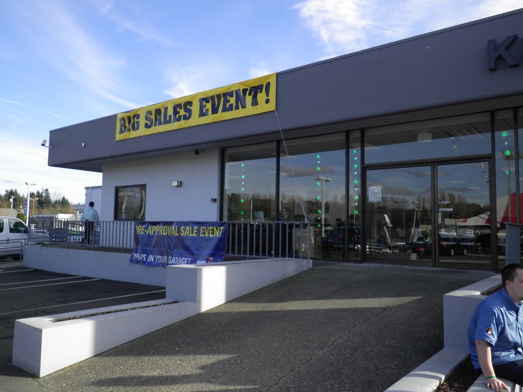
  • Dealership signage
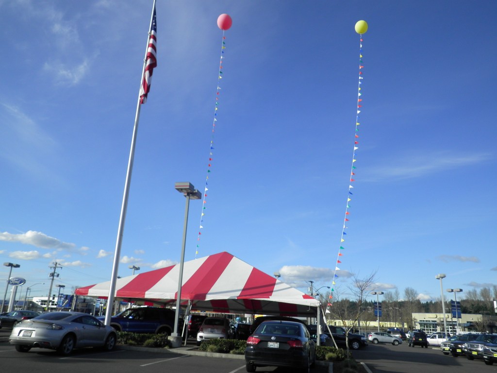
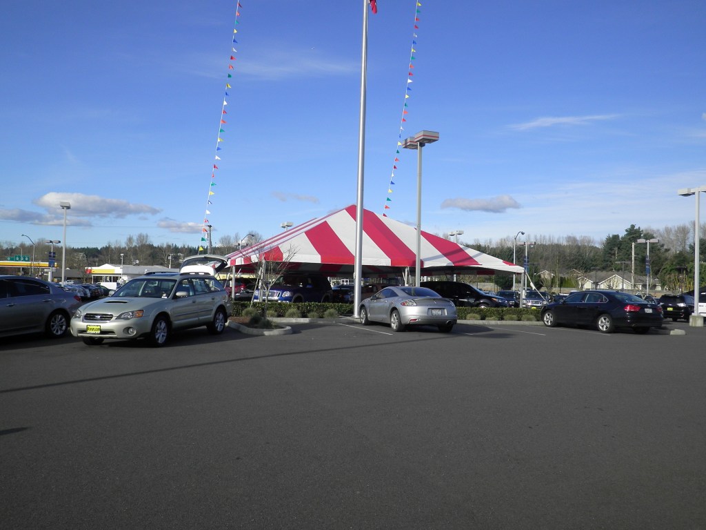
  • Tent sale promotional materials

Internal Communication

  • Printed newspaper advertisements distributed to each dealership location
  • Sales and management campaign updates
  • Event reference materials for customer-facing employees

My Role

As Marketing Specialist, I coordinated the dealership’s marketing efforts for the event while working with both internal stakeholders and external creative partners.

I designed the website banner, landing page, email marketing, dealership signage, and many of the supporting digital assets used throughout the campaign. The newspaper advertisements and television commercial were created by external creative partners, but I played an active role in shaping both. For newspaper ads, I selected the featured vehicles, provided images and campaign requirements, verified vehicle availability before publication, ensured OEM compliance, and worked closely with the newspaper designer. I often adapted the same visual elements from the print advertising into the website, email, and landing pages to create a consistent experience across every customer touchpoint.

For the television commercial, I developed the campaign concept, wrote the script, selected imagery, collaborated throughout production with the agency, and even participated in selecting the voice talent. Beyond the creative work itself, I coordinated campaign timing, distributed marketing materials internally, and ensured dealership staff understood the promotion before customers began responding.

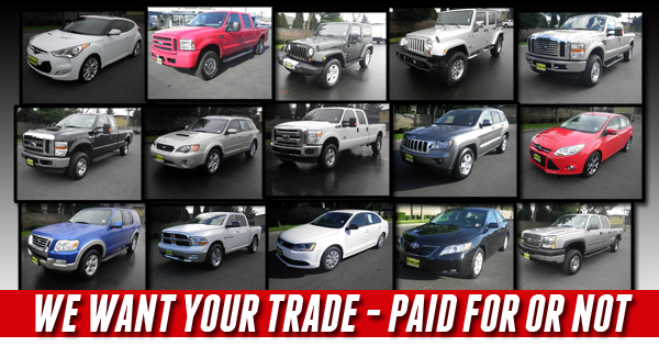
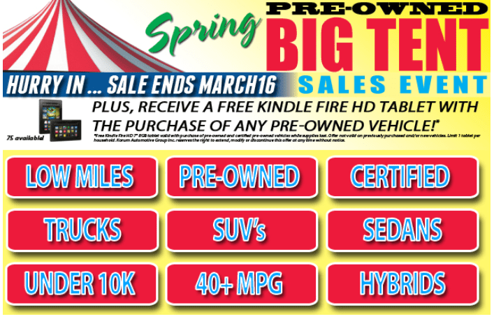
One enhancement I introduced was organizing featured inventory into customer-friendly categories—including Low Miles, Certified Pre-Owned, Trucks, SUVs, Sedans, Under $10K, 40+ MPG, and Hybrids. Rather than requiring visitors to filter inventory themselves, the campaign helped shoppers immediately navigate to the vehicles most relevant to them. Those same categories appeared consistently across both the landing page and email marketing, creating a familiar experience regardless of where customers entered the campaign.


How Everything Worked Together

The success of a campaign depends on much more than attractive marketing materials. Every customer interaction should reinforce the same message while making the next step obvious.

Consistent Branding

Every campaign asset – from the television commercial to the website banner, landing page, email marketing, newspaper advertisements, and dealership signage – shared a consistent visual identity. Customers encountered the same event branding regardless of where they first learned about the sale.

Consistent Messaging

Every communication emphasized the same key offer: the Spring Big Tent Sales Event and the opportunity to receive a Kindle Fire HD with the purchase of a pre-owned vehicle.

More importantly, I wanted customers to move beyond simply learning about the event. By organizing inventory into intuitive categories such as Trucks, SUVs, Under $10K, and Hybrids, the campaign helped shoppers quickly narrow their options without having to navigate complex search tools. The same categories appeared on both the landing page and in email marketing, creating a seamless transition between marketing channels.

Consistent Timing

Marketing activities were carefully coordinated throughout the event. The television commercial, newspaper advertisements, Facebook advertising, social media posts, website updates, and email campaign were scheduled to reinforce one another before and during the sale, maximizing visibility while keeping messaging consistent.

Internal Communication

One principle I consistently applied was ensuring employees were just as informed as customers.
Before advertisements appeared publicly, I distributed printed copies of newspaper ads to each dealership location so salespeople and managers understood exactly what customers would be seeing. This gave employees a common point of reference and helped ensure customers received knowledgeable, consistent responses whether they arrived because of a commercial, newspaper ad, email, or website promotion.

Marketing is most effective when customer-facing employees understand the campaign as well as the marketing department does.


Campaign Highlights

  • Multi-channel marketing campaign spanning television, newspaper, website, email marketing, Facebook, and in-store signage
  • Custom landing page with curated shopping categories (Low Miles, Trucks, SUVs, Under $10K, Hybrids, 40+ MPG, Certified Pre-Owned, etc.) to simplify vehicle discovery
  • Coordinated with the newspaper designer by providing featured vehicles, campaign direction, and final inventory verification before publication
  • Extended the newspaper creative across digital channels by adapting the same visual style into website banners, landing pages, email marketing, and Facebook content for a consistent customer experience
  • Worked with an external production agency to develop the television commercial, including campaign concept, script writing, imagery selection, and creative review
  • Printed and distributed campaign materials to every dealership location so salespeople and managers understood the promotion before customers arrived
  • Maintained OEM compliance across all customer-facing marketing materials
  • Created a unified customer journey that connected traditional advertising, digital marketing, and the in-store experience

Campaign Gallery

Campaign Overview Documentation

Facebook Ads

Homepage Banner & Landing Page

Design Insight: Instead of directing every visitor to a general inventory page, I organized vehicles into common shopping categories such as Trucks, SUVs, Under $10K, and Hybrids. This reduced the effort required to find relevant vehicles and created a consistent experience between the email campaign and landing page.

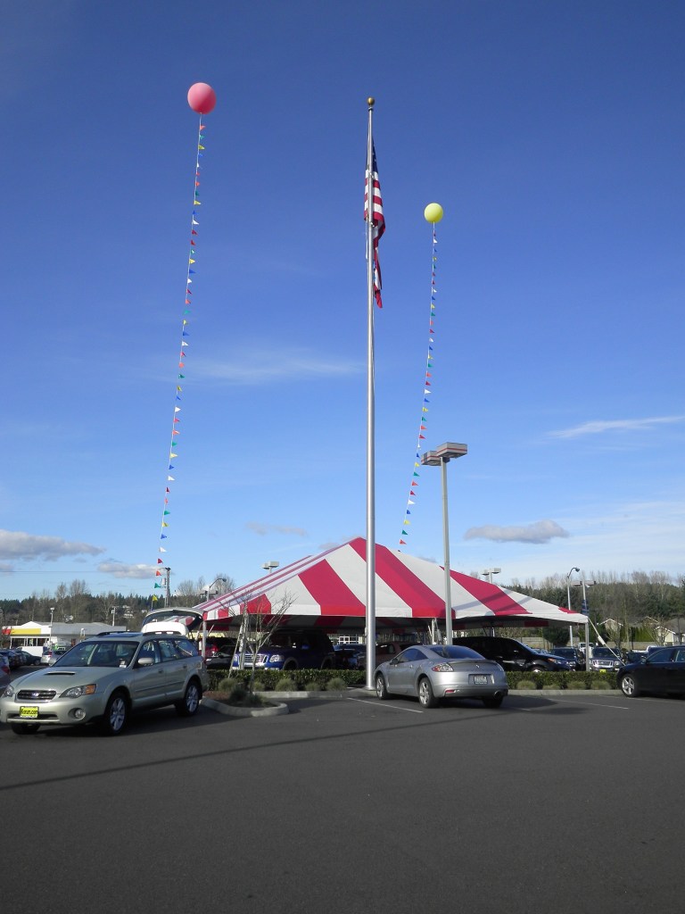
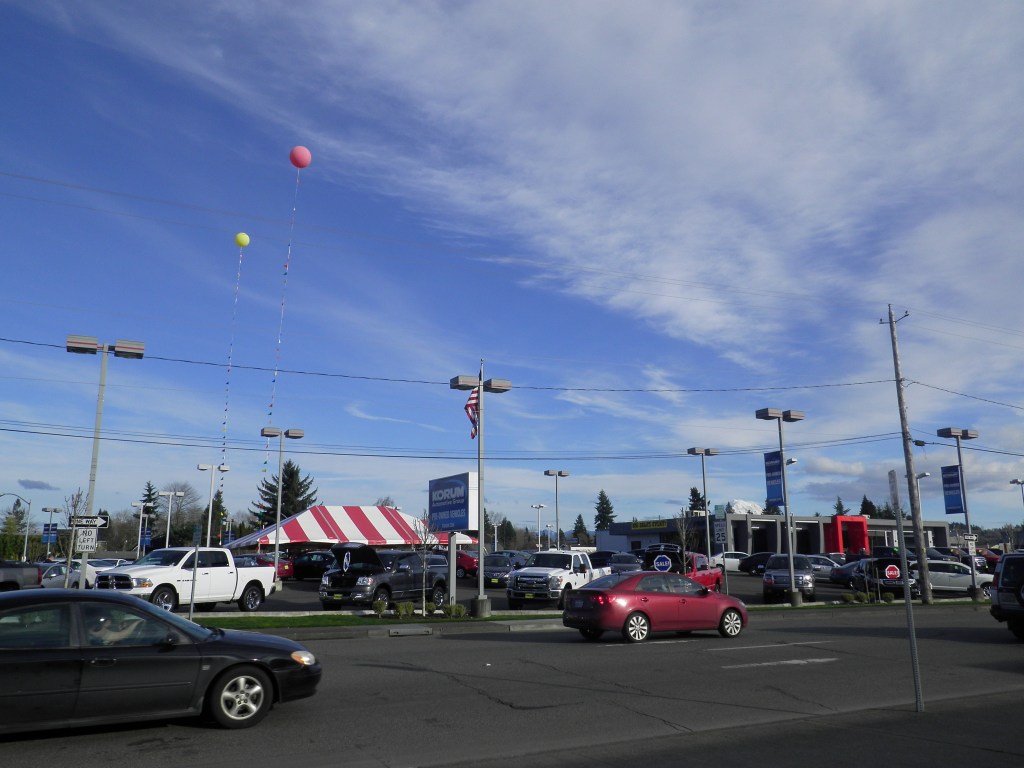
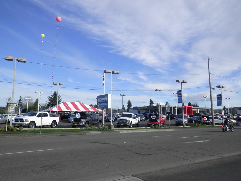
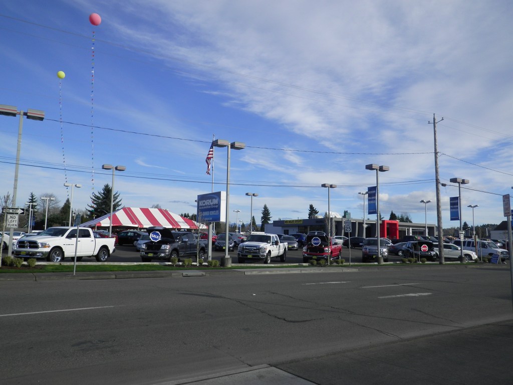
Event Setup Photos

Designing a Multi-Channel Event Marketing Campaign for a Community Automotive Event

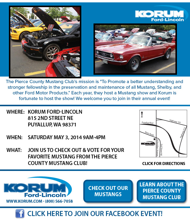
A one-day community automotive event celebrating the 22nd annual Pierce County Mustang Club Mini Show hosted at the dealership. The objective was to drive attendance, increase engagement with Mustang enthusiasts, and encourage voting participation through coordinated digital, email, and in-store promotion.

Campaign Assets

  • Facebook Event creation and promotion targeting Mustang enthusiasts
  • Google+ event listing to reach automotive community audiences active on emerging social platforms
  • Foursquare event listing to encourage check-ins and in-location engagement
  • Email marketing campaign to Mustang customers and dealership database
  • Landing page mirroring email content with event details and CTAs
  • Printed event flyers provided by Mustang Club, distributed throughout dealership
  • In-store signage and directional materials
  • Google Maps visual showing updated event location near fleet building

My Role

I owned the end-to-end coordination and execution of the dealership’s marketing presence for the Mustang Mini Show. I created the digital campaign assets including the Facebook event, Google+ event, Foursquare listing, landing page, and email marketing communications. The email and landing page shared a unified message and design structure, ensuring consistency across digital touchpoints.

While the Mustang Club provided a basic printed flyer, I selectively incorporated only usable elements and enhanced the overall presentation using OEM-approved Mustang imagery and high-quality event photos from prior years. This allowed the dealership’s materials to feel polished and aligned with our brand standards while still honoring the club’s participation.
I also created a custom Google Maps visual highlighting the updated event location, since the show had moved to a new area near the fleet building. This helped reduce confusion and improved on-site navigation for attendees.

How Everything Worked Together

This campaign was designed around meeting enthusiasts where they already were and reinforcing the event through repeated, consistent exposure across platforms.
  • Consistent branding: The same Mustang-focused visuals and messaging were carried through email, landing page, and Facebook promotion to create instant recognition.
  • Consistent messaging: All materials emphasized the same key points—event timing, location change, voting participation, and community celebration.
  • Consistent timing: Communications were sequenced leading up to the one-day event, with reminders reinforcing urgency as the date approached.
  • Internal communication: Printed flyers and digital assets were shared with dealership staff so they could actively promote the event in-person and help direct visitors.

Together, these elements created a unified experience where customers could discover the event online, receive reminders socially, and then experience the event in-person without confusion or disconnect.


Campaign Highlights

  • Multi-channel event promotion spanning Facebook, Google+, Foursquare, email, landing page, and in-store signage
  • Targeted Facebook advertising focused on Mustang enthusiasts, achieving significantly lower cost-per-click due to strong audience affinity and engagement
  • Creation of an event-specific landing page aligned with email marketing content for seamless digital experience
  • Use of a custom Google Maps visual to support a location change and improve on-site navigation
  • Repurposing and enhancement of Mustang Club-provided materials with OEM imagery and prior event photography for improved visual quality
  • Strong emphasis on enthusiast audience targeting, leveraging organic passion and engagement within the Mustang community
  • Integration of dealership staff into promotion efforts through printed materials and internal communication
  • Support for emerging social platforms (Google+ and Foursquare) to maximize reach across early-stage digital channels

Campaign Gallery

Campaign Overview Documentation

Email Marketing / Landing Page