
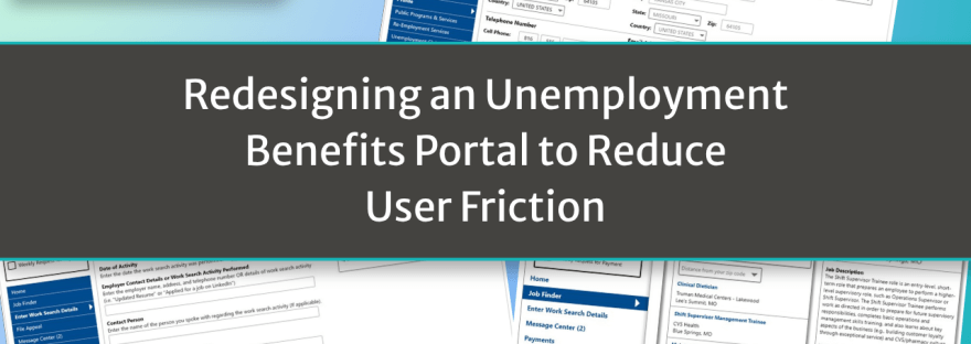
An independent UX redesign project that reimagined a confusing government unemployment portal with a stronger focus on usability, clarity, and helping users complete critical tasks with confidence.
Note: This is an independent redesign project created for portfolio purposes and is not affiliated with or endorsed by the State of Missouri. The goal was to analyze an existing user experience and demonstrate my approach to improving usability through thoughtful, user-centered design.
Project Snapshot
- Organization: Independent UX Design Project (Missouri Unemployment Portal)
- Role: UX Designer & Researcher
- Timeframe: 2020
- Primary Focus: User experience design, information architecture, usability improvements
- Audience: Job seekers navigating the unemployment claims process
- Deliverables:
- UX evaluation
- Website redesign concepts
- Desktop and mobile interface mockups
- Design rationale presentation
- Tools:
- Adobe XD
- PowerPoint
The Challenge
After being laid off during the COVID-19 pandemic, I visited my state’s unemployment website to understand what steps I would need to take if I needed to file a claim. Although I was fortunate not to rely on unemployment for long, I immediately noticed how difficult the site was to navigate. Important tasks were buried, terminology wasn’t always clear, and I often found myself wondering whether I was completing the correct steps.
This project became an opportunity to examine the experience through the eyes of a first-time user. People visiting an unemployment website are often already under significant stress, so every unnecessary obstacle increases frustration and uncertainty. I wanted to explore how thoughtful UX design, clearer language, and better organization could make the experience more approachable and easier to navigate.
My Approach
Rather than starting with visual design, I first walked through the website as though I were a new user trying to complete common tasks. I documented every point where I hesitated, became confused, or needed additional information before continuing.
As I redesigned each screen, I focused on reducing cognitive load rather than adding new features. I looked for opportunities to make important tasks easier to discover, replace technical language with more familiar terminology, and provide helpful guidance before users encountered confusion.
Having recently completed formal training in Adobe XD while collaborating with product and UX teams, this project also gave me an opportunity to apply those skills independently and demonstrate how user-centered design can improve even familiar workflows.
What I Created
- Comprehensive usability review of the existing unemployment portal
- Desktop and mobile redesign concepts
- Improved navigation and information architecture
- Integrated job search concept within the portal
- More prominent work search activity log
- Contextual help text for complex questions
- Simplified, user-friendly navigation labels
- Redesigned profile and account management experience
- Presentation documenting usability issues alongside proposed solutions
Results & Impact
Although this was an independent concept project rather than a production implementation, it demonstrates my approach to identifying usability challenges and designing practical improvements.
The redesign focused on:
- Making critical tasks easier to locate
- Reducing confusion through clearer language
- Improving navigation for first-time users
- Supporting both desktop and mobile experiences
- Demonstrating user-centered design thinking
- Presenting design decisions with clear supporting rationale
My Process

Observe: I approached the website as a first-time user, documenting every moment of uncertainty, hesitation, or unnecessary effort required to complete common tasks.
Understand the Goal: Users weren’t visiting the site to explore; they needed to accomplish important tasks quickly during a stressful time. Every design decision needed to support that goal.
Remove the Friction: I simplified navigation, surfaced commonly used features, clarified terminology, and introduced contextual guidance where users were likely to have questions.
Design for People: Rather than assuming users understood government terminology or internal processes, I designed around plain language, clear organization, and predictable interactions.
Measure Adoption: Although this project wasn’t implemented, I evaluated each redesign decision by asking whether it reduced effort, improved discoverability, or made the overall experience more intuitive.
Refine & Improve: Each screen went through multiple iterations as I continued identifying opportunities to simplify workflows and improve the overall user experience.
Key Takeaways
This project reinforced that effective UX design begins with empathy. People rarely approach software with the same understanding as the teams who build it, especially during stressful situations. By observing the experience from the user’s perspective and questioning every point of friction, small design changes can have a meaningful impact on usability and confidence.
It also strengthened my ability to communicate why design changes matter—not just what should change. Every recommendation was supported by a specific usability issue and a clear explanation of how the redesign addressed it.
Work Samples
This project includes:
- Original website screenshots
- Annotated UX evaluations
- Desktop redesign mockups
- Mobile redesign mockups
- Before-and-after comparisons
- Design rationale and explanations for each improvement
 Sally Scott