
Project Preview
An independent UX redesign project that reimagined a confusing government unemployment portal with a stronger focus on usability, clarity, and helping users complete critical tasks with confidence.
Note: This is an independent redesign project created for portfolio purposes and is not affiliated with or endorsed by the State of Missouri. The goal was to analyze an existing user experience and demonstrate my approach to improving usability through thoughtful, user-centered design.
- Role: UX Designer & Researcher
- Organization: Independent UX Design Project (based on the Missouri Unemployment Portal)
- Time frame: 2020
- Project type: Portfolio concept project
- Primary focus: User experience design, information architecture, usability improvements
- Tools used: Adobe XD
Where This Was Used
This was an independent project to demonstrate my UX research and design abilities.
What I Created
In this project, I completely redesigned the unemployment portal user experience in a way that I found to be more logical and user-friendly.
This redesign includes:
- A comparison of the existing unemployment portal to my redesign with explanations of changes, with both desktop and mobile experiences documented.
- Home Page: A more welcoming home page that explains the purpose of each section of the site, a to-do list, a simple calendar, and quick access to messages with a count of unread messages, user profile, and log out option.
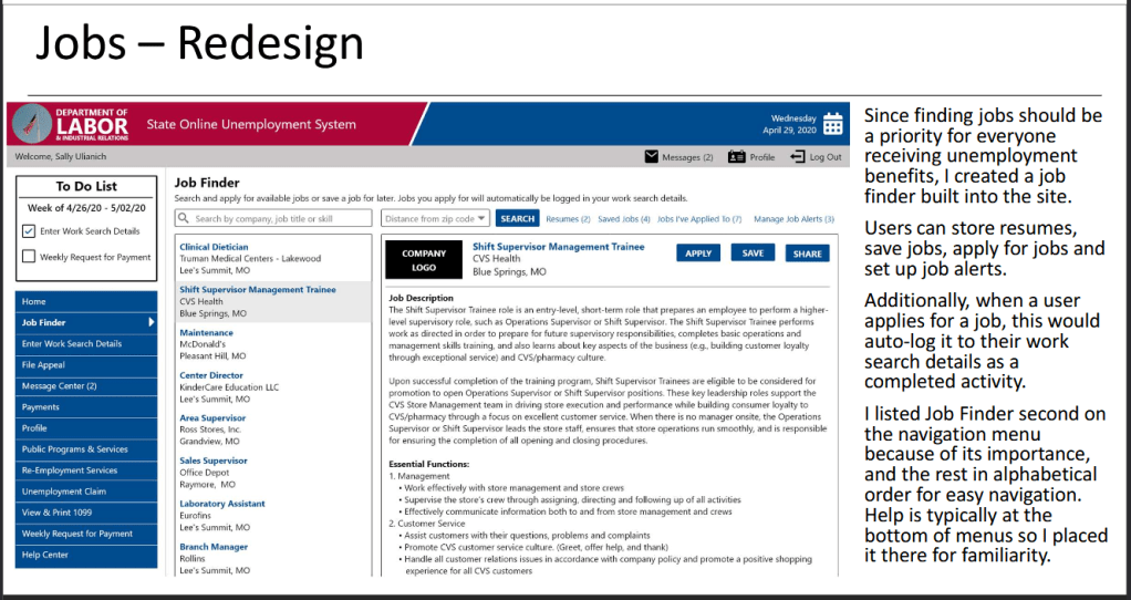
- Jobs: Since finding jobs should be a priority for everyone receiving unemployment benefits, I created a job finder built into the site that would automatically log applied jobs and allow users to create job alerts.
- Work Search Activity: In the original portal, users logged work search activity in a section titled “weekly request for payment” which was unintuitive. In my redesign, I added an “enter work search activity” tab to the navigation so users could easily find it and log details.
- Messages: In the original portal, messages were in a section titled “correspondences” and required users to select from a confusing menu to find important messages. In my resign, I created a simple “message center” easily accessible from the top and side navigation with an unread message count indicator.
- Profile: On the original site, profile information was found under “update address” which is confusing since this section contained much more than just the user’s address. I created a “profile” section that cleanly displayed their information, making it easy to update.
Why I Created It
Although this was a project that existed solely for portfolio purposes, I designed this because of my philosophy that things should be designed with the end user as the primary focus. This seems like such an obvious statement, but in reality, a lot of software is designed the way it is because there was a lack of research, a lack of direction, or it was the simplest way for developers to complete the project to create a minimally viable product.
When I designed this, it was during the COVID-19 pandemic and I had been laid off. I had some UX research and design experience, but none that I could publicly share for potential jobs. Since I was eligible for unemployment, I decided to check out my state’s unemployment and found an opportunity for improvement.
Who I Created It For
I designed this with unemployment portal users in mind. I have a lot of experience in the tech world, having worked for multiple software companies and providing software tutorials, and even I struggled to navigate the site. I imagined how a non-technical person would struggle to do even the simplest things within this portal, so I decided to use this as an opportunity to demonstrate how I can take a confusing experience and realistically make it usable by even the most non-technical users.
How I Created It
Observe
As someone eligible for unemployment, I got to experience firsthand how confusing it was to navigate the state’s unemployment site and how not user-friendly it was. I thought, if I – as a quite tech-savvy person – struggled this much, I know others must be struggling as well.
Understand the Goal
The ultimate goal of unemployment is to provide it when people most need it, but also to document their efforts toward getting off of unemployment, and ultimately finding a new job so they no longer need unemployment benefits.
Remove the Friction
The biggest friction was how complicated it was to navigate the site and to understand where to go to fulfill the requirements to receive unemployment benefits. I also opted to add some features that would assist users in finding jobs and navigating the site more easily.
Design for People
When I was working on this project, a few things stood out to me that were potential hindrances for users. One of these was that there was a requirement to perform and log job search activities, but this was not clearly stated on the site and there was not a job finder functionality, so I made that a focal point in my redesign – to make finding a job easier for those who most needed it.
Entering job search activities was one of the most frustrating experiences on the site, but also one of the most important for users since it was required to receive unemployment benefits. My redesign significantly improved this experience by creating a clear path to adding work search details and keeping a log of job searches, making it easy for user to keep track of their efforts.
Even receiving messages through the portal was confusing. The section was titled “correspondences” and emphasized the type, which had little to no meaning for the user. In my redesign, I titled it “message center”, added an unread message count indicator to alert users that they have unread messages, and I simplified the interface so it looked more like an email inbox rather than an unfamiliar path of government jargon.
Evaluate Results
While this was just a project I created to demonstrate my UX research and design skills, the concepts can be applied in many environments. Too often do software companies focus on what’s easiest to accomplish quickly instead of focusing on how the tool will actually be used.
This project shows how small changes can be implemented to create a more positive and logical experience can be created for users when you just stop and actually walk through the steps necessary to accomplish the most basic things. These changes I made weren’t earth-shattering, but they would have significantly improved usability for users of the unemployment portal and potentially helped them to find a job and no longer need unemployment benefits faster than the existing system.
Refine & Improve
As with any tool it’s important to test and evaluate its effectiveness. For the unemployment portal, metrics could be tracked to determine how long people used it to claim benefits, how long it took them to complete basic functions on the site, and how many appeared to give up before completing necessary steps. This could then be compared to a more streamlined redesign to gauge how effective making a portal more user-friendly can be, with solid statistics.
What It Accomplished
Although this was an independent project intended to represent my UX research and design experience, it is a realistic example of the type of work I did.
It demonstrates my ability to:
- Analyze a user experience
- Find opportunities for improvement
- Understand software design (e.g. Bootstrap)
- Perform UX research
- Use Adobe XD to redesign software
- Create cohesive desktop and mobile experiences
- Design for non-technical users
- Write logical explanations for changes to software
Explore the Project
Below you can view the project overview with screenshots and explanations I created for this project.
View the embedded file below or click the “view PDF” button to open it in a new browser tab.

